From counts to histogram: reading quantum results
The counts dictionary, the marginal, the distance from ideal. Plain Python for turning quantum output into something you can act on.

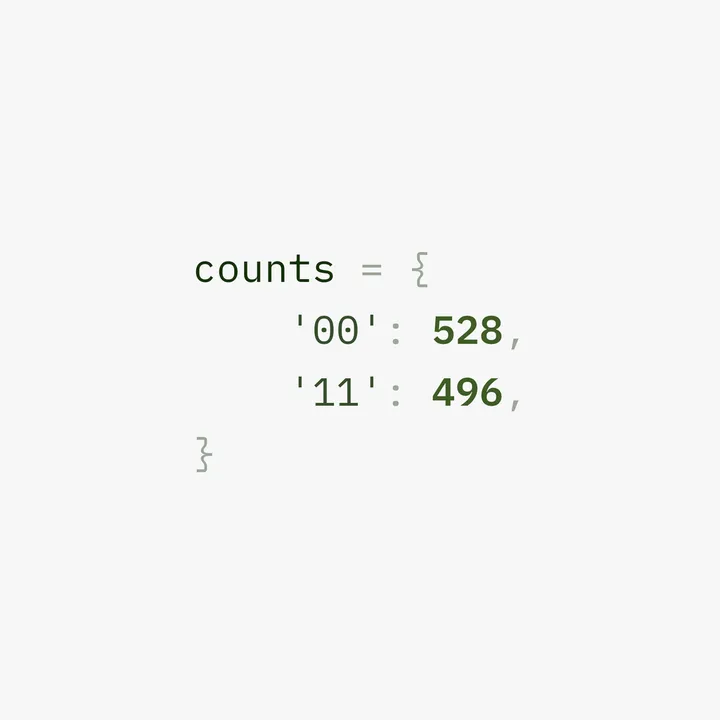
Almost every quantum circuit I have run in this series ends the same way: a dictionary of counts. Something like {'00': 528, '11': 496}. It is the output of the whole machine, the thing you actually read to find your answer, and for a while I treated it as a slightly mysterious object that quantum hands you at the end. It is not mysterious at all. It is a plain Python dictionary, and reading it is ordinary Python you already know. This post takes that output apart completely, in plain code, so the last bit of mystery drains out of the result.
What the counts dictionary actually is
When you run a circuit for some number of shots, the machine runs it that many times and records what it measured each time. The counts dictionary is just the tally. The keys are the outcomes, as bit strings, and the values are how many times each outcome came up.
counts = {'00': 528, '11': 496}
That is the entire object. It says: out of the shots I ran, 528 came back as 00 and 496 came back as 11. Nothing else happened, those were the only two outcomes seen. If you have ever counted occurrences of anything in Python, with a dictionary or Python's collections.Counter, this is exactly that, and the quantum machine is just the thing that generated the tally. The mystery, if there was one, is gone already. It is a histogram in dictionary form.
From counts to probabilities
The raw counts depend on how many shots you ran. To get something comparable and meaningful, you convert to probabilities, which is just each count divided by the total. This is the Born rule from the measurement post, arriving as plain arithmetic: the fraction of shots that gave an outcome is your estimate of that outcome's probability.
total = sum(counts.values())
probabilities = {outcome: round(n / total, 3) for outcome, n in counts.items()}
print(probabilities)   # {'00': 0.516, '11': 0.484}
Run it. You divide each count by the total number of shots and get the probability of each outcome, roughly fifty fifty here, exactly what a Bell state should give. This is the single most useful transformation you will do on quantum output, because probabilities are what the theory predicts and what you compare against. The counts are the raw data. The probabilities are the answer, and turning one into the other is a one line dictionary comprehension. No quantum knowledge required for this step, just division.
Reading it like a result, not a blob
A dictionary in arbitrary order is hard to read at a glance, so the next thing I do is sort it, usually by outcome so the bit strings line up in order, sometimes by count to see the winners first. Sorting quantum output is the same as sorting any dictionary.
total = sum(counts.values())
for outcome in sorted(counts):
    p = 100 * counts[outcome] / total
    print(f"|{outcome}>  {p:5.1f}%   ({counts[outcome]} shots)")
Run it. Now the outcomes come out in a tidy, ordered list with their percentages and raw counts side by side, which is far easier to scan than a jumbled dictionary. This tiny bit of formatting is the difference between staring at a blob and reading a result. And it generalises straight to bigger circuits: a three qubit result has up to eight keys, 000 through 111, and the same sorted loop lays them out in clean binary order, exactly the slot ordering from the tensor product post.
A histogram you can read in the terminal
You do not always need a fancy plot. A surprising amount of the time, a text histogram printed right in your terminal tells you everything you need, instantly, with no plotting library at all. The trick is to turn each probability into a bar of characters.
counts = {'00': 496, '01': 35, '10': 31, '11': 530}
total = sum(counts.values())

for outcome in sorted(counts):
    p = counts[outcome] / total
    bar = '#' * round(p * 40)        # 40 characters = 100%
    print(f"|{outcome}>  {p*100:5.1f}%  {bar}")
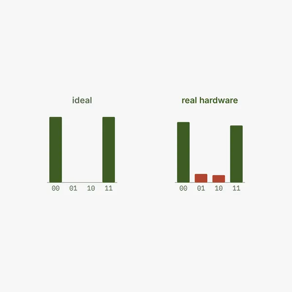
Run it. You get a little bar chart in plain text, each outcome's bar as long as its probability, and the shape of the result jumps out immediately. In this example, 00 and 11 have long bars and 01 and 10 have stubs, which is exactly the picture from the real hardware post: the two correct outcomes dominate, with a little noise leaking into the impossible ones. You can read the health of a run at a glance from the bar lengths, and you wrote the whole chart in four lines of standard Python. I reach for this constantly, because it is instant and it travels anywhere a terminal does.
When you do want the real plot
Qiskit ships a proper plotting helper for when you want a clean image, for a notebook or to share. It is called plot_histogram, it lives in the visualization module, and you hand it the counts dictionary directly.
from qiskit.visualization import plot_histogram
import matplotlib.pyplot as plt

counts = {'00': 496, '01': 35, '10': 31, '11': 530}
plot_histogram(counts)
plt.show()
This needs matplotlib installed, and it pops up the familiar bar chart with the outcomes on one axis and counts on the other. It is the right tool when you want something polished. But notice what it is doing under the hood: exactly what the four line text version did, counts to bars. The library version is prettier and saves you the formatting, and it is genuinely handy, but it is not doing anything you could not do yourself, and knowing that is the point. The plot is convenience, not magic.
Reading one qubit out of many: the marginal
On a bigger circuit you often care about just one qubit, not the full joint outcome. The counts dictionary has the full bit strings, so to read a single qubit you sum the counts over all the others, which is called taking a marginal. One subtlety first: Qiskit writes its bit strings little endian, qubit 0 on the right, the same convention that has come up in the Python and gates posts. So the rightmost character of each key is qubit 0.
from collections import defaultdict

counts = {'00': 496, '01': 35, '10': 31, '11': 530}
marginal_q0 = defaultdict(int)
for bits, n in counts.items():
    marginal_q0[bits[-1]] += n     # rightmost char = qubit 0

print(dict(marginal_q0))   # {'0': 527, '1': 565}
Run it. By summing over everything except the last character, you collapse the four outcomes down to just what qubit 0 did, ignoring qubit 1 entirely. Here qubit 0 came out roughly balanced, which for a Bell state is exactly right, since each qubit alone looks like a coin, the marginal point from the entanglement post. This is the same operation as a pivot or a group by in any data work: you have detailed records and you aggregate away the columns you do not care about. Pick the character position for the qubit you want, sum, done. No quantum reasoning in the code, just grouping a dictionary by part of its key.
Comparing two results: how far from ideal
Often you want to know how close a real, noisy result is to the ideal one, a single number for the gap. A simple, honest one is the total variation distance: turn both into probabilities, take the absolute difference outcome by outcome, add them up, and halve. Zero means identical, one means completely different.
counts = {'00': 496, '01': 35, '10': 31, '11': 530}
total = sum(counts.values())
measured = {k: v / total for k, v in counts.items()}
ideal = {'00': 0.5, '11': 0.5, '01': 0.0, '10': 0.0}

outcomes = set(measured) | set(ideal)
tvd = 0.5 * sum(abs(measured.get(o, 0) - ideal.get(o, 0)) for o in outcomes)
print(round(tvd, 4))   # 0.0604
Run it. You get about 0.06, which says this example run is close to ideal but not perfect, and conveniently it lines up with the roughly six percent of shots that landed in the wrong bins in this example. One number, easy to compute, that summarises how far a result drifted from what it should have been. It is the kind of metric you compute to track whether a device or a circuit is behaving, and it is nothing but dictionary lookups, subtraction, and a sum. The statistics are standard. The quantum part already happened upstream.
The top outcomes, when there are many
For a circuit with many qubits you can get dozens of outcomes, most of them tiny, and you usually only care about the few biggest. Sorting by count and taking the top handful is the move, the same top-k you would do with any tally.
counts = {'00': 496, '01': 35, '10': 31, '11': 530}
top = sorted(counts.items(), key=lambda kv: kv[1], reverse=True)[:2]
print(top)   # [('11', 530), ('00', 496)]
Run it. You sort the items by their count, highest first, and slice off the top two, leaving the noise behind. On a large result this is how you cut through a cluttered histogram to the outcomes that actually carry the signal, which are usually the answer you ran the circuit to find. Sort, reverse, slice. The exact pattern you use to find the most common anything in Python, pointed at quantum output.
Saving results for later
One more practical habit, because real work means coming back to results, not just glancing at them once. A counts dictionary is plain data, so you can save it the way you save any data, and the obvious choice is JSON, since the dictionary maps onto it directly.
import json

counts = {'00': 496, '01': 35, '10': 31, '11': 530}
with open("run_result.json", "w") as f:
    json.dump(counts, f)

# later, or in another script
with open("run_result.json") as f:
    loaded = json.load(f)
print(loaded)   # {'00': 496, '01': 35, '10': 31, '11': 530}
Run it. You write the dictionary to a file and read it back identically, and now a run from today is something you can compare against a run from next week, or feed into a notebook, or hand to another tool. This matters more than it sounds, because quantum results are precious. A run on real hardware cost you a slot in a queue and a few seconds of an expensive machine, so throwing the numbers away after one look is wasteful. Save them. If you build automation pipelines, this is reflex: you persist anything that was costly to produce, and quantum output is exactly that. JSON for the structured dictionary, or a CSV row if you are logging many runs over time, and suddenly your experiments have a history you can analyse instead of a series of glances you half remember.
Putting it together: parse, summarise, decide
In practice these steps chain into a tiny analysis function, the kind of thing you write once and reuse on every result. Take counts, compute probabilities, find the most likely outcome, report it. That last step, picking the winner, is often the actual answer you ran the circuit for.
def summarise(counts):
    total = sum(counts.values())
    probs = {k: v / total for k, v in counts.items()}
    best = max(probs, key=probs.get)
    print(f"most likely outcome: |{best}>  at {probs[best]*100:.1f}%")
    return probs

summarise({'00': 496, '01': 35, '10': 31, '11': 530})   # most likely outcome: |11> at 48.5%
Run it. It tells you the most probable outcome and its probability, which for many circuits is precisely the thing you wanted to know. This is the bridge from the pipeline post, where the result came back as structured data, to an actual decision: you parse the counts, turn them into probabilities, and read off the answer. It is all standard Python, dictionaries and division and max, with no quantum specific machinery anywhere in the analysis. The quantum was in generating the counts. Everything after is just reading a tally.
A quick test before you move on
Close this and answer in your own words.
What are the keys and the values in a counts dictionary? If you cannot say the keys are outcome bit strings and the values are how many times each came up, reread the first section.
How do you turn counts into probabilities, and why is that the step that matters? If divide each count by the total is not your answer, and you cannot connect it to the Born rule, revisit the probabilities section.
And what is plot_histogram actually doing that you could not do in a few lines yourself? If you cannot describe counts to probabilities to bars, reread the section on the text histogram, because the whole point was that none of this is mysterious.
Where I am learning it
Free, and most of it is just Python you may already have. The Qiskit documentation covers plot_histogram and the visualization tools, and the broader Python skills, dictionaries, comprehensions, sorting, formatting, are the same ones from any solid Python introduction. The text histogram trick is not from any course, it is just a habit worth stealing, because a chart you can print anywhere beats one that needs a plotting stack. As always, I learned this by running real circuits and parsing their output by hand, because a result I have only had a library hand me prettily is not one I fully understand until I have torn the dictionary apart myself.
The output was never the mystery
For a while, the counts dictionary felt like the one genuinely quantum thing at the end of a circuit, the mysterious payload the machine hands back. It is the least mysterious part of the whole process. It is a tally, a plain Python dictionary of outcomes and how often they happened, and reading it is division, sorting, and a little formatting, the most ordinary code there is.
That was a relief to internalise, and it is a pattern worth carrying. The quantum strangeness, if it is anywhere, is in the superposition and the interference and the entanglement, in how the counts came to be. The counts themselves are just data, and you already know how to read data. The exotic part ends at the measurement. Everything after is Python you have written a hundred times.