I made 58 themes for myself, then measured every colour in them
I change my editor to match my mood, so one theme was never going to be enough. 28 families, dark and light, every colour taken from something real, then measured on the surface it sits on.

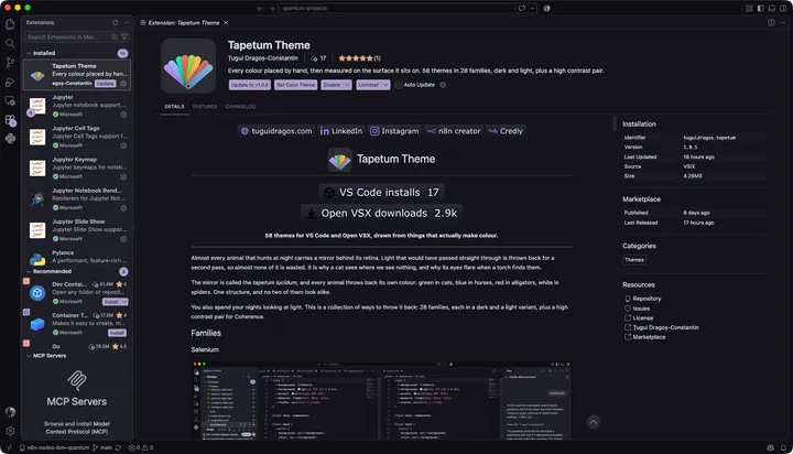
I change the colours when the work changes
Some weeks I want the editor to disappear. Some weeks I want it to be the most interesting thing on the screen. I have never managed to keep one theme for longer than a couple of months, and at some point I stopped treating that as a lack of discipline. It is just how I work. A hard debugging week and a quiet refactoring week do not want the same room.
So I made one. Then I made another one, because the first was wrong for a Tuesday. Then I noticed I was making a set, and that the set had a problem: the ones I made in the afternoon were comfortable to read, and the ones I made at one in the morning were not, and I could not tell which was which by looking at them. Enthusiasm is not a measurement.
There are 28 families now, each in a dark and a light variant, plus a high contrast pair, which comes to 58. I built every one of them for myself, which is not the first time I have made the thing I could not find. I put them on the marketplaces because there was no reason not to, and because if you also change your editor when the work changes, you now have somewhere to change it to.
I read the code, which is why the colours matter
I found VS Code years ago and never left. That is not a verdict on the alternatives, it is the ordinary loyalty you develop for something simple that shows you the code and then gets out of the way. I work in it every day and I have never wanted to move.
A preference is not a testing strategy, though. The themes ship to Open VSX as well as to the Marketplace, which is where VSCodium, Cursor, Windsurf, Gitpod and code-server install from, so I installed them in Cursor and in Windsurf and went through the families there myself. They come out identical: the same 991 values, the same surfaces, the same structure, because the forks inherit the same theming layer underneath. I could not have told you that without opening them, and telling you anyway is exactly the habit this project exists to avoid.
What I do have an opinion about is reading. I spend my days building systems where one wrong assumption quietly breaks everything downstream, and the only defence I have found is to read the thing, all of it, including the parts I am sure about. It is the same reflex that had me submit one quantum circuit 20 times to find out which error the machine would actually return. I want to know what is happening in the heart of my own projects.
That is the whole reason a colour theme is worth this much trouble. If you are going to read a file line by line, legibility is not decoration, it is the floor you are standing on. A comment that has been dimmed slightly too far costs you nothing on the day you skim and everything on the day you are hunting. So the rule I gave myself was simple: I choose the colours, and then a machine checks whether I can actually see them.
Every family comes from something real
The other rule was that no palette gets invented. If a family needs six colours, those six come from something real, and I go and find out what it is before I open the editor.
This started as a constraint to stop me fiddling and turned out to be the most useful decision in the project. A palette pulled out of the air can be adjusted forever, because nothing says it is finished. A palette taken from an emission spectrum is finished when the spectrum runs out.
Selenium is a good place to start, because it is the one I keep coming back to. Selenium toning is a darkroom process: you bathe a silver print in a selenium bath and the blacks shift toward purple while the tonal range stretches at the same time. The result is an image that is warm in the shadows and cool in the highlights at once. So this family does not pick six separate hues at all. It picks a ladder of lightness and lets the hue rotate as the ladder descends, which is why it stays out of the way for hours.
A laser cannot emit magenta, so Coherence does not contain one
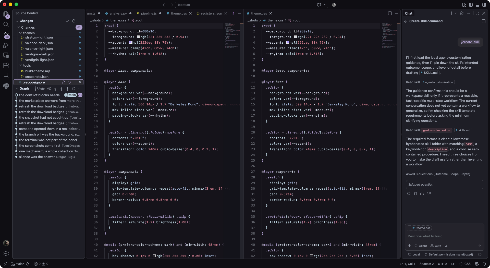
A mixed argon and krypton ion laser puts out these six visible lines, among others, from a single tube at once, which is what a white laser actually is. Argon gives 457.9, 488.0 and 514.5 nanometres. Krypton gives 413.1, 568.2 and 647.1. Six lines, six roles in the code, and the mapping writes itself.
Then I got to the part that made me like this family more than any of the others. There is no magenta in it. Not because I ran out of roles, and not because it would have clashed, but because magenta is not a spectral colour. It does not have a wavelength. Your brain manufactures it when the red and blue cones fire together and the green ones stay quiet, and no laser in the world can emit one. A family built out of laser lines cannot contain a colour that lasers cannot make, so it does not.
The interface in Coherence falls to true black for the same reason. If the premise is that everything you see is emission, then the surface the emission sits on should not be emitting anything.
I did not decide any of that. The physics decided it and I typed it in.
Water eats red first, so Hadal's red is almost grey
Depth removes colour in a fixed order. Red is gone by about 5 metres, orange by 20, yellow by 50, green by 100, and below 200 metres there is only blue left. Hadal makes that the rule instead of the theme: the colours that survive deepest get the most light and the most saturation, and the ones that die shallow are left faded on purpose.
Which means the red in Hadal is almost grey, and that is not a mistake I failed to catch. It is the point. If you are down there, red is the first thing you lose.
One material, two colours, so one family with two variants
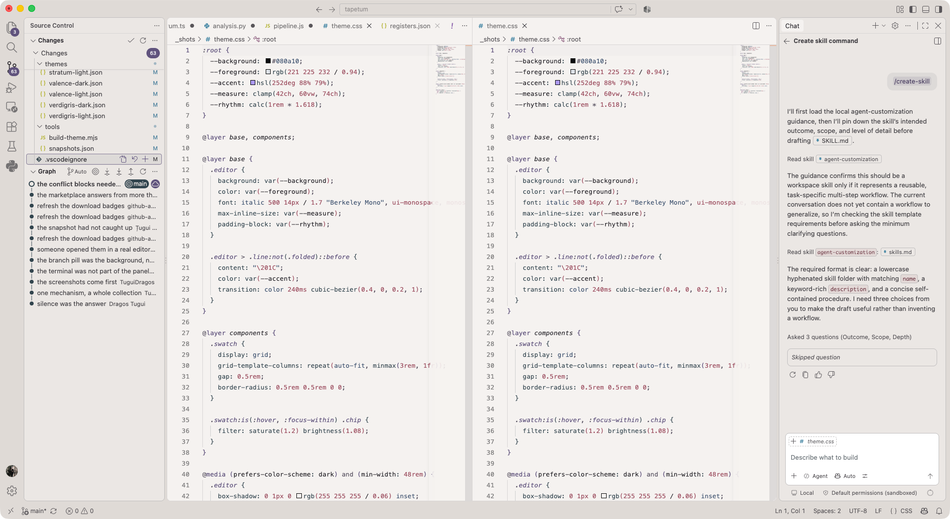
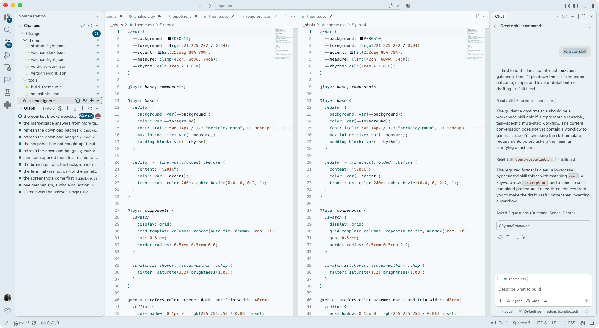
Aerogel is 99% air and it scatters short wavelengths the same way the sky does. Hold a block against a dark background and it looks blue. Hold it up to a lamp and the light that comes through is amber. Same material, no pigment, two completely different colours depending on which side of it you are standing.
Every other family here has a dark variant and a light variant because I made two. Aerogel has them because the material does. The dark one is the reflection and the light one is the transmission, and it is the only pair in the collection that comes from one physical fact rather than two.
A dichroic filter splits, so there is no third hue
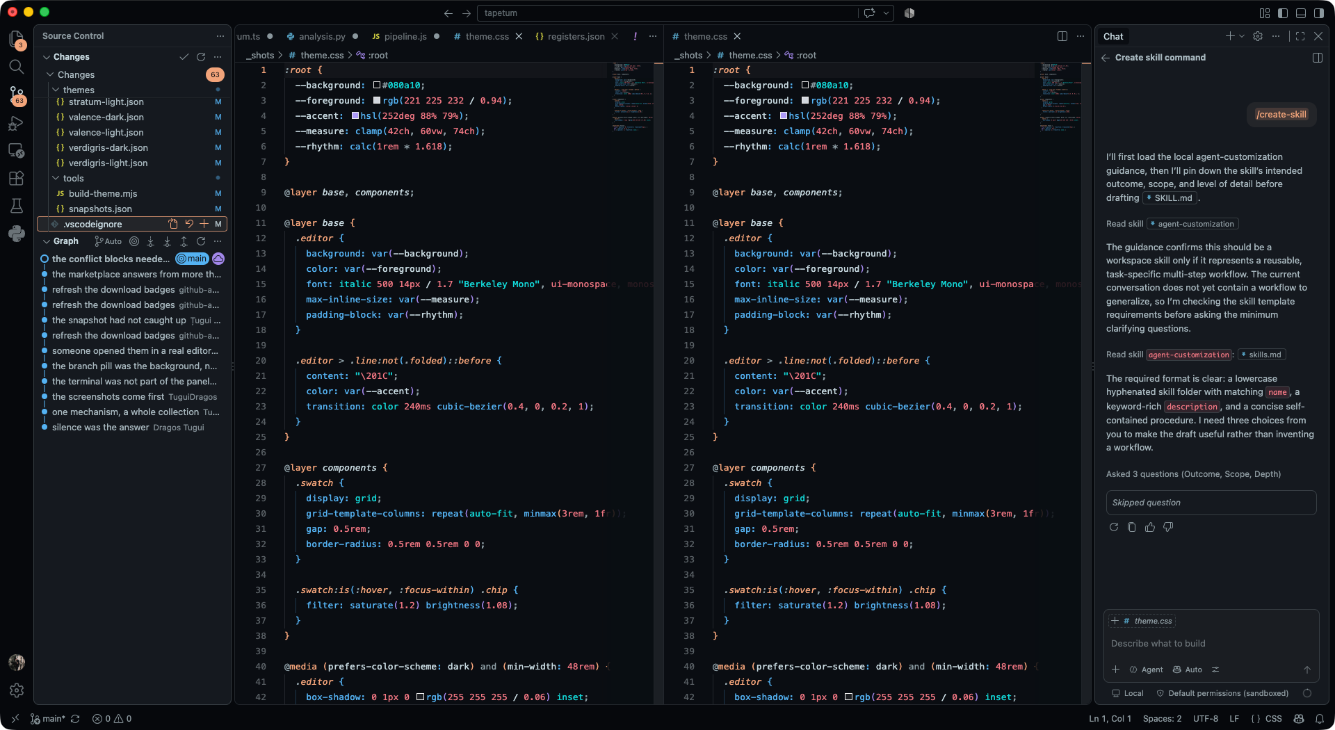
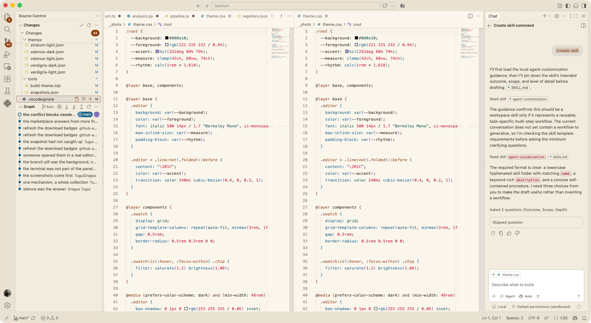
A dichroic filter absorbs nothing. It splits. What passes through has one colour and what reflects has exactly its complement, and there is no third option anywhere in the system.
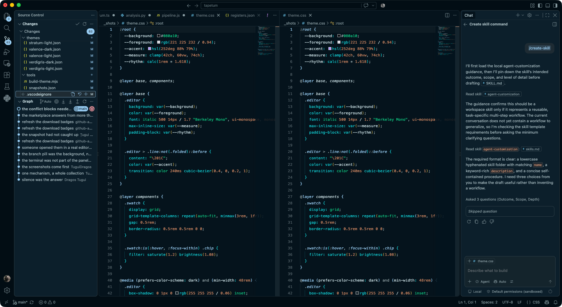
So Dichroic has two hues in the whole of the code. Structure travels through the filter and takes the teal. Data reflects back and takes the magenta. That is the entire palette, and after ten minutes with it you stop reading syntax categories and start seeing the shape of the file.
The terminal is the one place that breaks the rule, because red and green have to stay red and green. A theme that renames the colour of a failing test to fit its own concept has stopped being a theme and started being a nuisance.
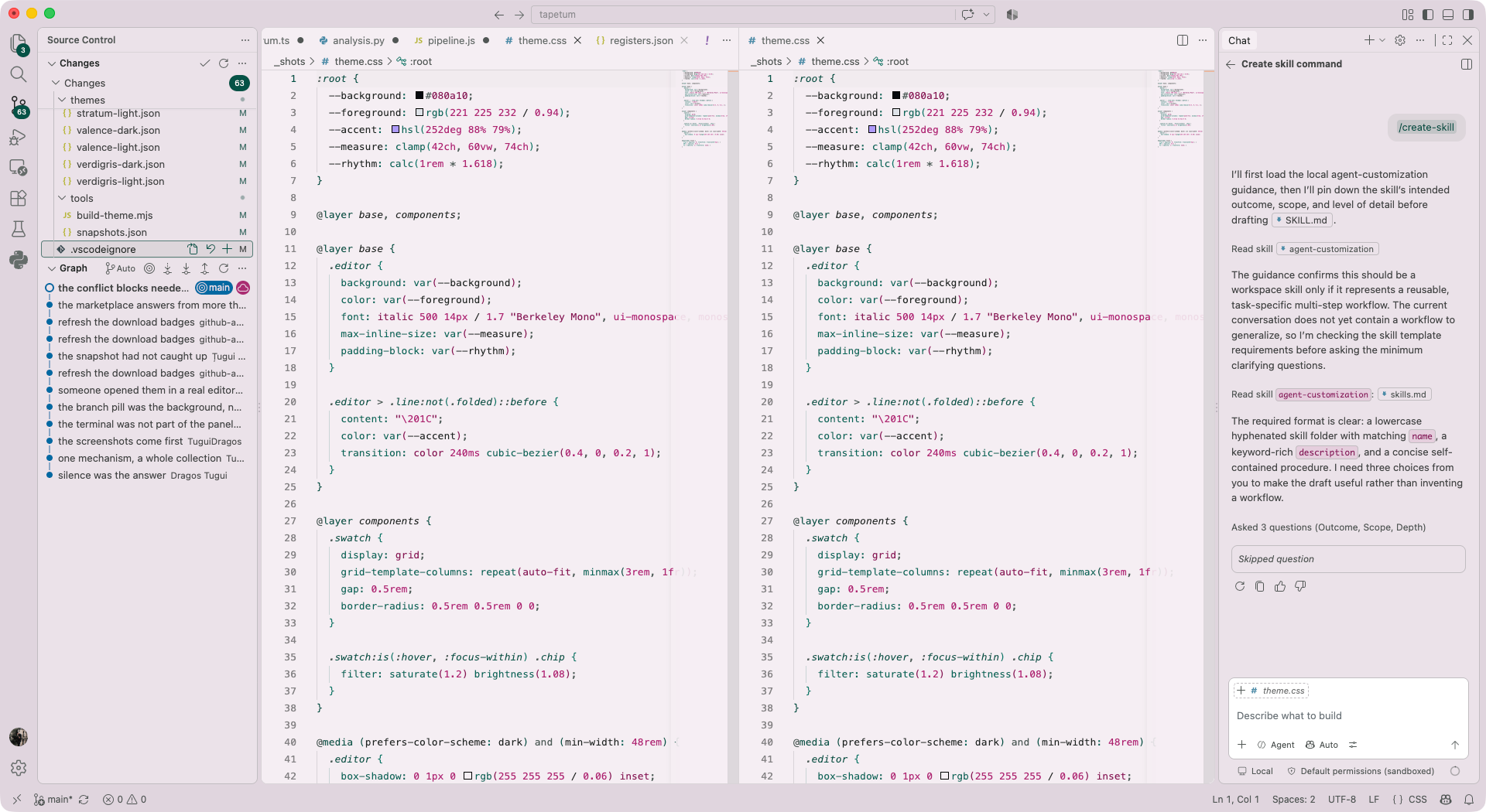
Cochineal is a colour you had to farm insects for
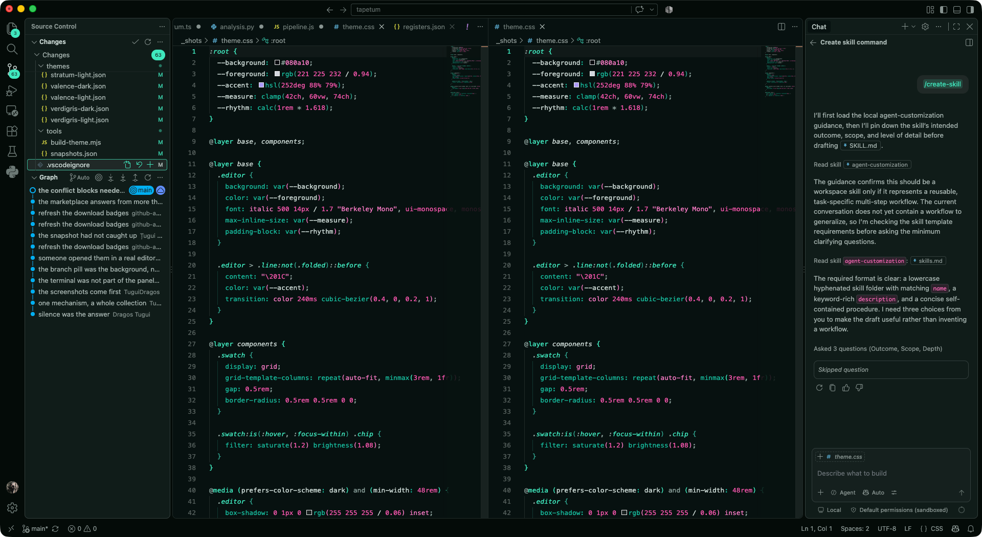
Cochineal is a scale insect that lives on cactus, and carminic acid is what it makes to keep ants away. It gave Europe a scarlet stronger than any it had. It was worth close to silver by weight, it took roughly 70000 insects to make a pound of dye, and for two centuries Spain guarded the source so carefully that most of Europe did not know it was an animal at all.
In this family the background is the crimson sunk into the cloth and the syntax is the same dye at different strengths. It is the warmest thing in the collection, and it is the one that gets the strongest reactions, in both directions.
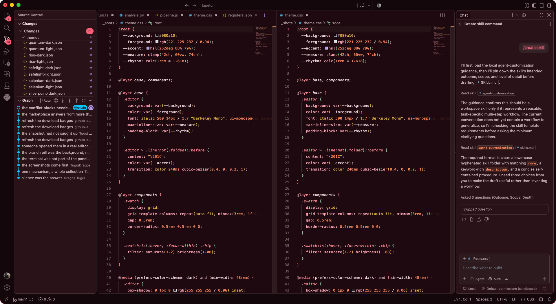
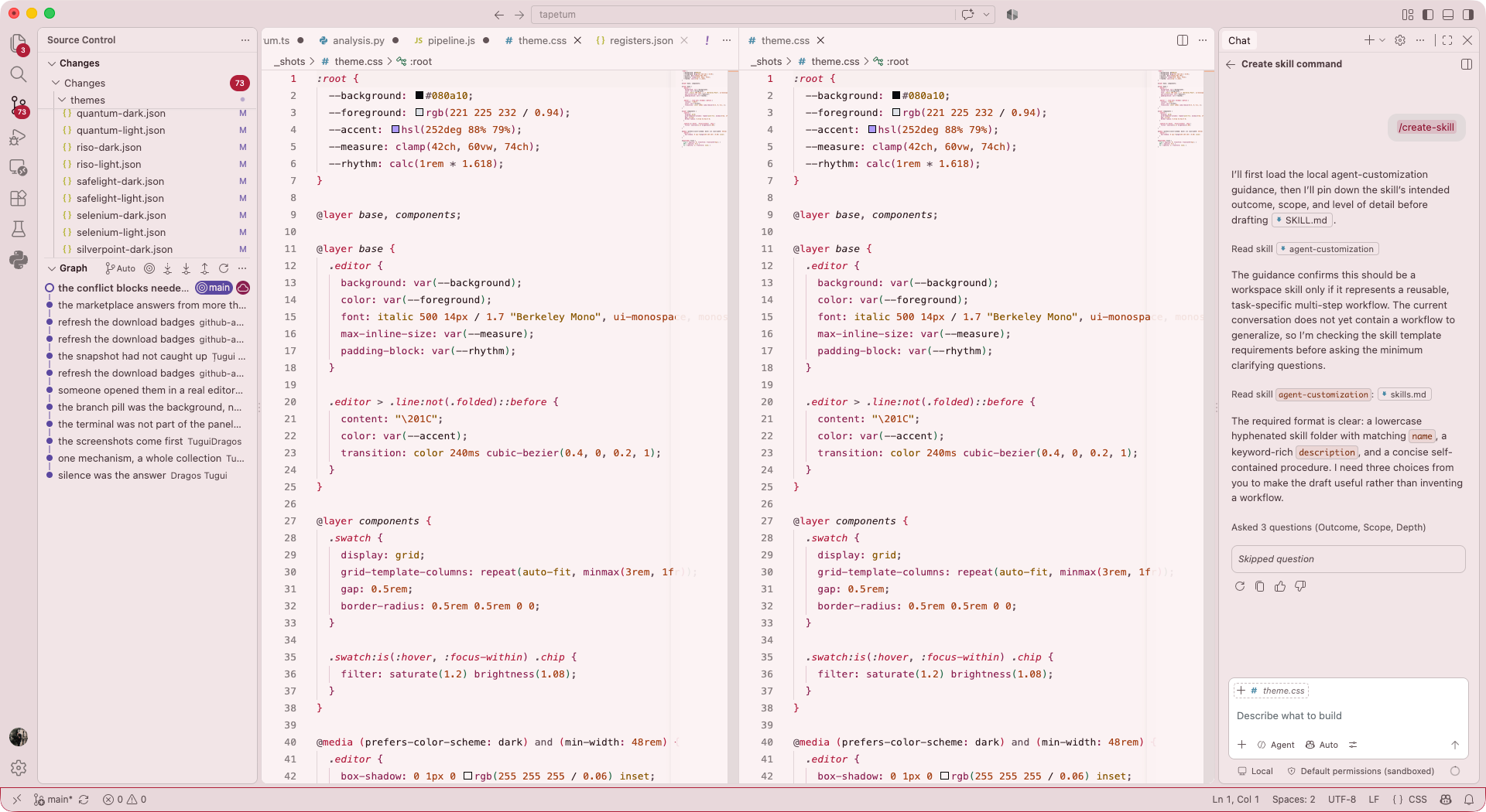
Some of them colour by what the code does, not what it is
Almost every theme in existence answers one question: what kind of symbol is this. Keyword, string, number, type. It is a good question and 22 of the families answer it, but it is not the only one worth asking, and the answer is a property of the theme rather than a property of the editor, which means changing theme can change the question.
Effect colours by whether a line touches the outside world. await, async, throw, catch and every mutation burn. Functions that only compute, the types, and the data stay cold. It is the same idea a type system uses to track effects, except you can see it without reading a signature, and the first time you open a file you have not touched in a month it tells you where the danger lives before you have read a word.
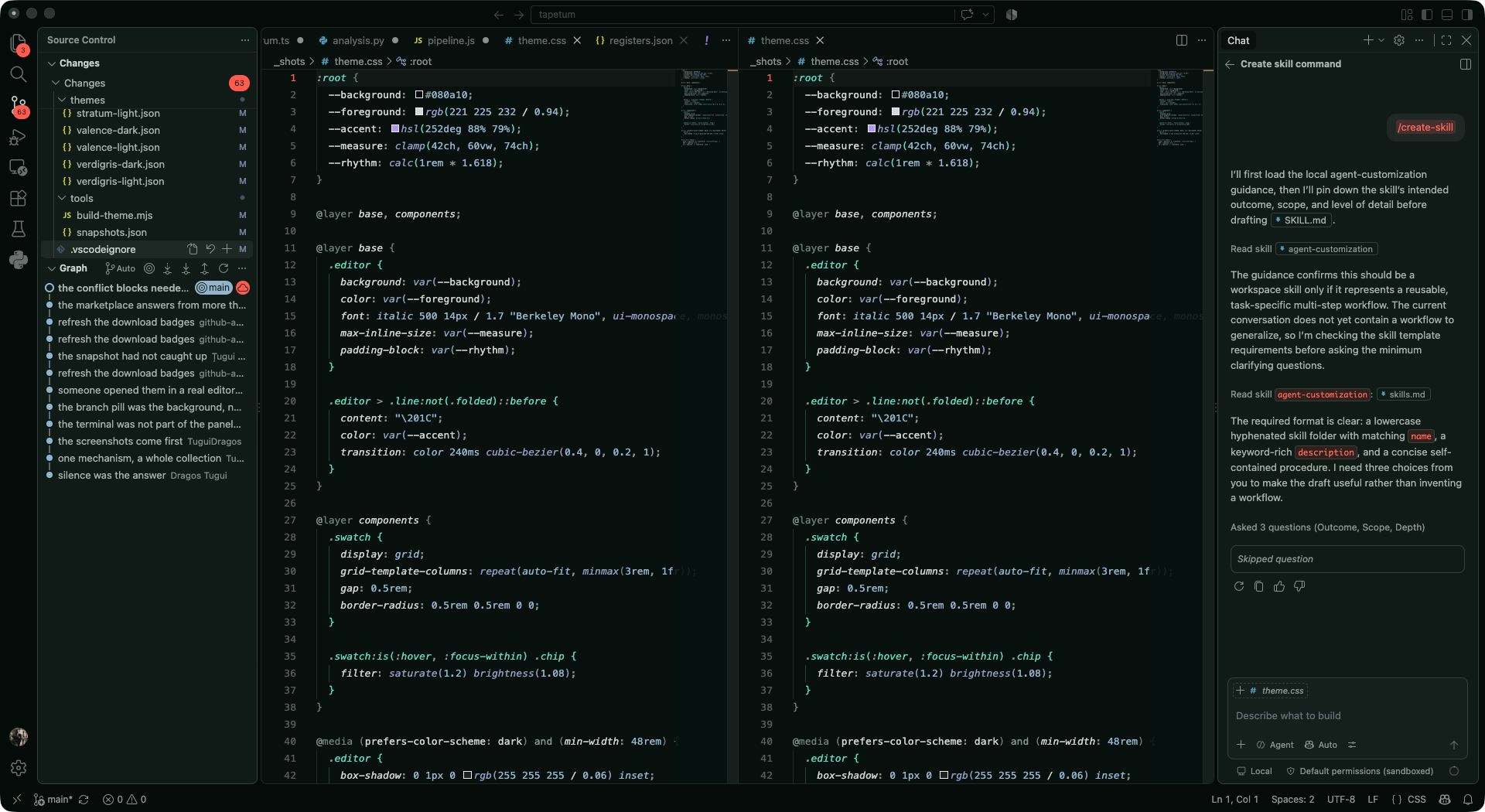
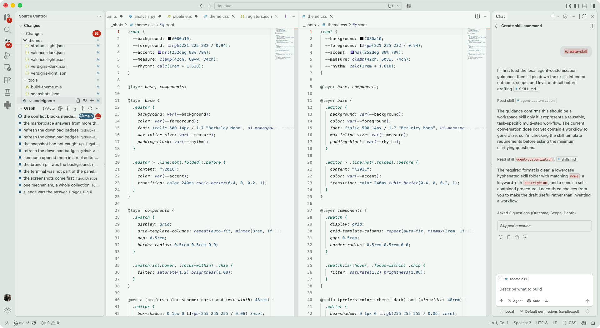
There are five more like it. Provenance colours by where a symbol came from: gold for what you wrote here, cyan for what the language handed you, violet for what cannot change, and the keywords are deliberately dimmed, because you already know function is a function. Borrow colours by whether a value can change, and lights up a name at the exact point you write to it. Palimpsest pushes keywords, imports, punctuation and type annotations back toward the background, so only the names you chose stay lit. Silverpoint and Stratum remove hue from the code entirely and do the work with tone, weight and italic.
Three of those read your language server rather than the grammar, using the semantic tokens it emits, including the declaration, defaultLibrary, readonly, static, modification and async modifiers that most themes never touch.
These are six of the twenty eight families. The rest are in the repository, each with the thing it came from written next to it: Fraunhofer from the absorption lines Joseph von Fraunhofer found in sunlight in 1814, Epitaxy from the real emission peaks of materials grown on a silicon wafer, Persistence from oscilloscope phosphor decay, Incandescence from the temperature scale a blacksmith reads by eye, Noctiluca from living light, Cherenkov from the blue glow in a reactor pool.
Placing the colours was the easy half
Colour is a judgement call, so every value in here was placed by hand. What a machine is good for is catching what a person misses, and it turns out a person misses an enormous amount.
The editor registers 966 colour keys. Not the twenty you think of, not the two hundred a normal theme sets, but 966, covering the chat surfaces, the agent panels, inline edit, notebook cells, the modern tabs, the sticky scroll, the ruler beside the minimap. Every one of the 58 themes sets all of them, plus the terminal palette and a handful of compatibility keys, which comes to 991 values per theme.
That number is not typed anywhere. A tool reads it out of the running editor, because a hand written list would go stale the first time Microsoft shipped a new surface. The same goes for what gets checked: another tool reads the workbench stylesheet out of the installed editor and collects every foreground and background used in the same rule, so what gets measured is what the editor actually paints together, not what I assumed it paints together. That currently comes to 83 pairs. A third tool reads the binary for the keys whose default is another key, 74 of them, which catches the class of bug where a value quietly contradicts the surface underneath it.
On top of that: every syntax colour against its own background, every pair of coloured roles against each other in CIEDE2000, the standard colour difference formula, so no two roles collapse into one, and every pair of families against each other so no two families are the same theme wearing a different name. The closest two families in the collection still average 12 dE apart, dE being that formula's unit of difference.
Syntax clears a contrast ratio of 4.5 to 1 against the background. Comments clear 4.0, because comments are supposed to recede. The lowest value anywhere in 58 themes is 4.07, and I know exactly which comment in which theme it is.
I also implemented APCA next to WCAG, because WCAG is a 2008 formula built on 1990s colour standards that does not model dark backgrounds well, and on a dark theme it will happily tell you that a colour is fine when your eye disagrees. The implementation is checked against the canonical reference values on every run, so if I break the measuring stick, the build tells me instead of quietly measuring everything wrong.
For comparison, since it is the fairest one available: the themes VS Code ships set between 36 and 347 of those keys, and several of them fail their own contrast pairs. That is not a criticism of the people who made them. It is what happens to any theme that is maintained by hand against a surface that grows every month.
An optimiser chose them once and made them worse
At one point I did the thing every engineer does and tried to automate the taste. I wrote an optimiser, gave it the contrast floors and the separation targets as an objective, and let it choose the colours.
It converged on something worse. Two of the families came out under 2 dE apart, which is close enough that most people would not see a difference at all, and it had bleached the keywords toward grey because grey is an easy way to satisfy a contrast constraint without satisfying anything else. Every number was green and the result was dead.
I threw it away and went back to placing colours by hand. The tooling kept the part it is good at, which is telling me when I am wrong, and lost the part it was never good at, which is deciding what I want.
The parts I got wrong
Two examples from the last week, both found by looking rather than measuring.
The first was a grey pillar. In the diff editor the scrollbar is 30 pixels wide and always visible, and I had made every slider fully opaque some releases earlier, after discovering that the one over the minimap was letting 90% of the minimap show through it. Over a file of eight lines the slider filled the entire track, so a small diff had a solid grey column standing next to it doing nothing. The overcorrection was mine and it took someone pointing at it for me to see it. The sliders are translucent now and firm up under the hand.
The second was louder. Every family takes its accent from the same place its syntax comes from, so how saturated that accent is depends entirely on what the family was drawn from: 6 in Silverpoint, 94 in Cherenkov. In a cursor or a focus ring that spread is the whole point of the collection. Filled into a button it is something else, and I kept glancing at the extensions panel thinking something needed answering. Nothing did. It was just the accent, sitting in a rectangle. Filled surfaces now cap the saturation at 45 and leave the hue and the lightness exactly as they were, so a family still looks like itself and stops raising its voice. 33 of the 58 were over the line and came down. The other 25 did not move.
Both of those are now checks. That is the actual working method here: I notice something with my eyes, and then I turn it into something the build can notice without me.
Where it lives
code --install-extension tuguidragos.tapetum
Or from the Visual Studio Marketplace, or from Open VSX, which is where VSCodium, Cursor, Windsurf, Gitpod and code-server install from.
Press Cmd K then Cmd T, or Ctrl K then Ctrl T, and type a family name to filter. Every family is Tapetum <Family> for the dark variant and Tapetum <Family> Light for the light one.
The code is on GitHub, all 58 palettes and the tools that check them. If you want to see whether any of this is true rather than take my word for it, clone it and run node tools/analyze.mjs.
If you would rather choose before you install, tapetum.tuguidragos.com previews all 58 in the browser, with screenshots from VS Code.
If something looks wrong, open an issue and we will measure it
Every colour in here was placed by hand, which means some of them are wrong in ways I cannot see from my own screen. Your languages are not my languages, your monitor is not my monitor, and there are 58 of these.
So if something reads badly, or a family looks off next to the code you spend your day in, open an issue and we will measure it together. That is how the merge conflict colours got fixed, and the grey pillar in the diff editor, and the buttons that looked like notifications. Every one of those came from someone looking at the thing and saying what hurt, which turned out to be a better test than any tool I had written.